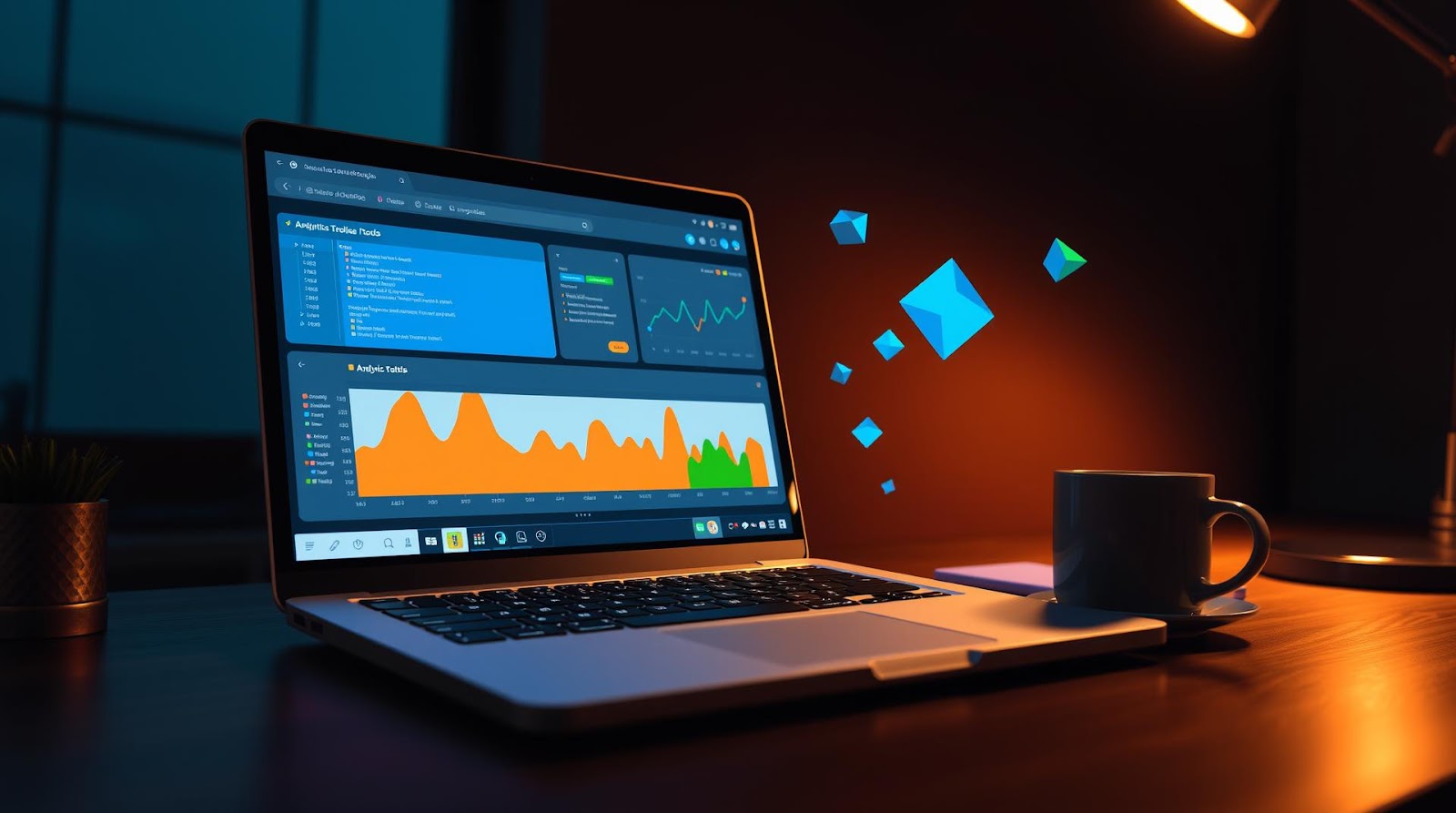
I remember my first week at Morningstar—sitting at my desk in the Mumbai office, opening up Excel, and realizing I had absolutely no idea what I was doing.
Not the technical part. The smart-choice part.
My manager dropped a dataset on my desk—about 2 lakh rows of fund performance data—and expected me to find patterns. I had my laptop, a mediocre internet connection, and exactly ₹0 allocated to "fancy analytics software." So I did what most of us do when we're broke and ambitious: I started hunting for free tools.
Seven years later, I've cycled through dozens of them. Some were garbage. Some changed how I think about data entirely. And the weirdest part? The best tools I use today are still completely free. Not "freemium with annoying popups"—actually free.
Here's what I've learned works, and more importantly, why it matters for you if you're making the same journey I did.
The Reality of Being a Broke Data Analyst (And Why That's Actually an Advantage)
Let me set the stage. When I first started, I thought I needed Tableau. Thought I needed Power BI licenses. Thought I needed fancy Python IDEs and cloud infrastructure.
And honestly? That's partly true. But here's what I got wrong: you don't need them *immediately*.
The real skill isn't knowing how to click buttons in expensive software. It's knowing *why* you're clicking them. It's understanding what questions your data can answer, and what it can't. It's being able to explain a 47-column dataset to someone who doesn't know SQL from a sandwich.
Every analyst I respect—and I mean genuinely respect, not just LinkedIn-connections-respect—built their foundation with free tools first. They learned to think clearly before they learned to visualize impressively. And that's not a limitation. That's a superpower.
The tools I'm about to show you? They work because they're *forced* to work. No premium features hiding behind paywalls. No shortcuts through bloat. Just raw, honest functionality.
The Seven Tools That Actually Changed My Game
1. Google Sheets (Yes, Really)
I know. I know. "But Dattatray, Google Sheets is not a real analytics tool."
Counterpoint: it's the first tool I reach for, and here's why.
When I get a dataset from a fund manager or a research team, I don't immediately dump it into Python or SQL. I put it in Google Sheets first. Why? Because I need to *see* it. I need to scroll through it. I need to spot the obvious errors—the negative returns that make no sense, the dates formatted three different ways, the names with typos.
I use Google Sheets for cleaning data, creating pivot tables, and building quick dashboards for stakeholders who panic at the sight of code. And here's the sneaky part: about 60% of the "analysis" I deliver internally is literally just a well-structured Google Sheet with some conditional formatting and a pivot table.
My colleagues use ₹50,000+ analytics platforms to do what I do in Sheets in 45 minutes. And the stakeholders love it because it's interactive, shareable, and literally anyone can understand it.
Free. Works offline. Collaborative. That's the holy trinity.
2. SQLite (The Quiet Overachiever)
Okay, so this is where things get real.
SQLite is a database engine that runs locally on your machine. It's not fancy. It doesn't scale to millions of records easily. But for someone analyzing datasets between 10MB and 2GB? It's untouchable.
Here's how I use it: I download a CSV, load it into SQLite, and query it with SQL. That's it. No cloud costs. No configuration. No learning curve if you already know SQL.
And the weird thing? Most of my actual analysis happens here. Not in Tableau. Not in Python. In SQLite. Because SQL forces you to be precise. You can't just "eyeball" a dataset—you have to ask specific questions.
Tools I use to interact with SQLite:
- DB Browser for SQLite — a free GUI that makes it as easy as clicking buttons
- Command line — if I'm feeling fancy (and slightly pretentious)
Cost: ₹0. Time to proficiency: 2 weeks if you already know SQL, 6 weeks if you don't.
3. Python (With Jupyter Notebooks)
I'll be honest: Python was intimidating.
But then I realized I wasn't trying to become a software engineer. I was trying to manipulate data. And Python, with the right libraries, makes that stupidly simple.
Specifically: pandas, matplotlib, and seaborn. That's 80% of what I need.
Pandas lets me load datasets, group them, filter them, create new columns—basically everything I'd do in Excel but faster and reproducible. Matplotlib and seaborn let me create visualizations without touching design software.
The setup:
- Download Python (free)
- Install Jupyter Notebooks (free, via pip)
- Start a notebook and write code in cells
- See results instantly
It's perfect for exploration. I spend maybe 30% of my time here—running statistical tests, building predictive models, transforming messy data into something usable.
And here's the thing I didn't expect: once you learn Python for data analysis, you start *thinking* differently about problems. You ask more precise questions. You test hypotheses instead of just guessing.
4. Plotly (For Visualizations That Actually Impress People)
Here's a confession: most data visualizations are boring.
And most of them don't need to be.
Plotly is a free charting library that creates interactive visualizations. I'm talking hover-over tooltips, zoom-in capabilities, animations—the kind of stuff that makes stakeholders actually *engage* with your work instead of glancing at a static image.
The best part? It integrates with Python. So I can generate visualizations programmatically from my data analysis.
One example: I was analyzing fund category returns over 10 years. Instead of a static line chart (snooze), I created an interactive Plotly visualization where you could toggle different fund categories on and off, zoom into specific periods, and see exact values on hover. Took me maybe 20 minutes. My director asked where I bought the analytics software.
It was free. It was Python. It looked professional because Plotly handles the design work for you.
5. DuckDB (The Speedrunner)
DuckDB is newer, and I'll be honest—I'm still figuring out all its capabilities. But what it does well, it does *really* well.
It's like SQLite's faster cousin. Perfect for analyzing CSV files directly without loading them into memory. If you have a 5GB dataset and your laptop has 8GB RAM, DuckDB lets you query it anyway. It's that efficient.
I use it when I inherit someone's "definitely not a database" folder full of CSVs. Point DuckDB at the folder, write SQL, and boom—instant analysis across all of them.
The learning curve is basically zero if you know SQL. And it's free.
6. Observable (For Sharing Analysis That's Actually Interactive)
This one surprised me.
Observable is a free platform where you write JavaScript to create interactive data visualizations. And I know what you're thinking: "But I don't know JavaScript."
Neither did I. But I learned enough to make interactive dashboards that I could share with colleagues—no downloads, no Excel files, just a link they click and explore.
It's not as polished as Tableau, and it requires some coding skills. But for sharing analysis with other data people? It's magical.
7. Notion (For Documentation and Process)
Okay, this one's a bit of a wildcard. Notion isn't strictly an analytics tool.
But here's what I realized: good analysis means nothing if nobody remembers how you did it.
I use Notion to document every analysis I do. What was the question? What data did I use? What assumptions did I make? What were the results? What limitations exist?
This is stupidly valuable. First, it forces me to be clear about my thinking. Second, when my director asks me six months later how I arrived at a number, I can literally show them the Notion page instead of reconstructing it from memory.
And honestly? It makes me look organized and thoughtful. Even if I'm not naturally either of those things.
| Tool | Best For | Learning Curve | Cost |
|---|---|---|---|
| Google Sheets | Cleaning, pivot tables, stakeholder dashboards | None | ₹0 |
| SQLite | Querying structured data locally | 2 weeks (if SQL-capable) | ₹0 |
| Python + Jupyter | Data transformation, statistics, ML | 6-8 weeks | ₹0 |
| Plotly | Interactive visualizations | 3-4 weeks | ₹0 |
| DuckDB | Fast querying of large CSVs | 1 week (if SQL-capable) | ₹0 |
| Observable | Shareable interactive dashboards | 6-10 weeks | ₹0 |
| Notion | Documentation and process | None | ₹0 |
How I Actually Use These Tools (A Real Example)
Let me walk you through an actual project I did last quarter, so you can see how these tools work together in practice.
A portfolio manager asked me: "Why are our mid-cap funds underperforming versus the benchmark?"
Here's my process:
Step 1: Data Collection (Google Sheets)
I got three CSVs: fund returns, benchmark returns, and fund holdings. I put them all in a Google Sheet, did a quick visual inspection, and immediately spotted that one CSV had returns in percentage format (5.3) while the other had decimal format (0.053). Fixed that in 10 minutes.
Step 2: Data Analysis (SQLite + Python)
I loaded everything into SQLite. Wrote queries to calculate rolling returns, volatility, and outperformance/underperformance versus the benchmark. Then I loaded the results into Python to run statistical tests (t-tests, correlation analysis) to see if the underperformance was statistically significant or just noise.
Spoiler: it was noise. Our funds weren't actually underperforming. They were slightly *ahead* when you accounted for market volatility.
Step 3: Visualization (Plotly)
I created three interactive Plotly charts:
- Fund returns vs benchmark over 5 years (line chart with hover)
- Rolling 1-year outperformance (bar chart showing months)
- Distribution of returns (histogram with statistical annotations)
These took maybe an hour total. Looked professional. Stakeholders actually clicked around and explored instead of just reading a deck.
Step 4: Documentation (Notion)
I created a Notion page documenting:
- The question asked
- Data sources and date ranges
- Methodology (which statistical tests I ran, why)
- Key findings (with confidence levels)
- Limitations (this data doesn't account for fees, for example)
- Links to the interactive visualizations
Total time: 4 hours. Cost: ₹0.
If I'd done this in Tableau and other paid tools? Probably 6 hours and ₹15,000+ in licensing.
The Tools You Should Learn In Order
If you're starting from scratch, here's my honest recommendation on what to learn first:
Month 1-2: Google Sheets + SQL (SQLite)
Get comfortable with data. Learn to think in queries. Understand what clean data looks like. This is foundational.
Month 3-4: Python Basics
Start with pandas. Learn to manipulate data programmatically. Don't worry about being fancy—just get comfortable.
Month 5: Plotly or Basic Matplotlib
Visualization is important, but it's useless if your analysis is bad. So wait on this.
Month 6+: Observable or other tools as needed
Once you're comfortable with the fundamentals, pick specialized tools based on what your work actually requires.
Don't try to learn everything at once. That's how you end up knowing 10% of 10 tools instead of 80% of 3 tools.
My Perspective
Here's what I got wrong for years: I thought being a "real" analyst meant using the same tools as the big investment banks. I thought I needed Tableau. I thought I needed cloud infrastructure. I thought I needed a setup that cost serious money.
Then I had lunch with a friend who works at a top fintech startup, and she told me something that stuck: "The best analysts I know don't use expensive tools. They use simple tools *really well*. They ask better questions. They understand their data deeply."
That conversation changed how I approached my own work. I stopped trying to impress people with fancy dashboards and started focusing on clear thinking. The tools followed naturally from that.
And here's the weird outcome: I'm more valuable to my team *now* than I was when I was trying to use Tableau. Because I can do things faster. I can explain my thinking clearly. I can adapt when requirements change. I don't need to wait for IT or vendor support—I just solve the problem.
The best part? Anyone reading this can do exactly what I did. It costs nothing but time. And honestly, it might be one of the smartest investments you make for your career.
Final Thoughts
The commute from Kalyan to Mumbai every day is about 90 minutes each way. I use that time to listen to data podcasts, think about problems, or just stare out the window and feel mildly productive.
But the real work—the analysis that matters—happens with the tools I've shared here. No fancy setup. No budget approval needed. Just a laptop, some free software, and the willingness to learn.
If you're where I was seven years ago—broke, ambitious, and convinced you need expensive software to be a "real" analyst—I'm here to tell you: you don't.
You have everything you need. Start with Google Sheets. Move to SQL. Pick up Python. The rest will follow naturally.
And honestly? The analysts who start this way end up being the best ones. Not because they're smarter. But because they had to think clearly about problems before they could hide behind visualizations.
That's a superpower that no amount of money can buy.
Dattatray Dagale
Data Analyst • Blogger • Mumbai
I'm a data analyst from Kalyan, Maharashtra, working at Morningstar. I write about personal finance, career growth, and everyday life for Indian millennials — the stuff I wish someone had told me earlier.
Written by Dattatray Dagale • 10 June 2026


.png)
.gif)


0 Comments